Poverty. It's a bit difficult to define who lives in poverty - I guess it's a relative thing, and depends on the standard of living of the people around you. Today we're going to take a look at the child poverty rates in several 'rich' countries (such as the United States).
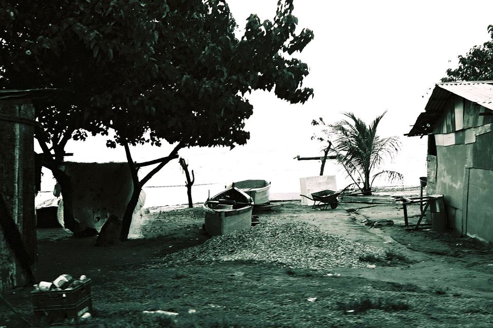
But first, here's a picture my friend Jennifer took on one of her many international trips. Can you guess what country it's in? And is this person living in poverty? On one hand, the house looks pretty rough - on the other hand, they have a house!
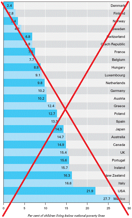
 While perusing the Internet, I came across the following graph on the washington.edu web site. There were several things I liked about the graph (it was an interesting topic, the bars were sorted, the axis starts at zero, the values were printed on the bars, it was easy to follow a bar to the country name, and it had subtle reference lines to help group the bars into 5% groups).
But, as with many graphs, I saw some room for improvement. Therefore I entered the data into a SAS dataset, and created my own version - very similar, but with some subtle changes:

Compare the two graphs and see if you can identify the improvements. Then check the list below and see if you noticed them all!
- I added a title above the graph.
- I added the year to the footnote.
- I made my text a little larger, and easier to read (especially along the bottom axis and footnote).
- I add a slight offset space after the 30% axis tick mark, so there's room to fit the 'Mexico' label without overlapping the bar.
- I used a percent format on the values along the bottom axis (now you don't have to read the footnote to see that the values are in percent).
- And, if you click the graph to view the interactive version, each bar has mouse-over text showing the country name and value.
Were there any surprises in the graph? Does the graph make you ask any questions? (I'm curious how similar, or different, the "national poverty line" is, in each country.)

10 Comments
World Population Prospects: The 2017 Revision
Country Poverty Ranking
Kazakhstan 0.0% 104 Less Poor
Montenegro 0.1% 100
Egypt 1.4% 80
Indonesia 6.6% 60
Kenya 18.7% 40
Cote d'Ivoire 31.0% 20
Niger 60.5% 1 Poorer
Rob: I made a table from the URL downloads below. I can send you the Excel file if you email me.
I enjoy your posts. Very helpful. Wex Lee
Thanks Wex! - you can send it to me at Robert.Allison@sas.com
The original graph's annotated source is the Innocenti Report Card #6 (Unicef). I was able to find the URL to the most recent Unicef Innocenti Report Card (#14)...below:
https://www.unicef-irc.org/publications/pdf/RC14_eng.pdf
Figure 1.1 in RC14 seems to most closely match the original graph/study (Figure 1.1 An average of one in five children in rich countries lives in relative income poverty ).
Hope this is helpful to those interested.
I've created a new graph, using the 2014 data from Figure 1.1:
http://robslink.com/SAS/democd18/child_poverty_2014.htm
Thanks for the tip!
Do you have access to more current data? 2005 info is quite dated. Love to see a comparison over time.
I don't know of any newer data, but if someone finds updated data I'd be happy to plot it. Here is the website where I found the 2005 data: https://depts.washington.edu/eqhlth/pages/charts.html
How about grouping by population size?
That might be interesting.
I like the improvements but wonder if the use of color could be improved. I get the alternating colors are more aesthetically pleasing but might it be more informative to use color to indicate continent or population size or something like that?
Sounds like a good idea!